COMMENT: What's In A Brand? - Ride UK BMX

BMX Every Day | #UKBMX

Share

Features

Words by Tom Edgington


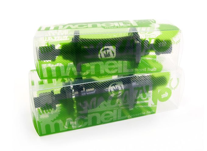
When it comes to purchasing a new part, how do you go about making a decision on which to buy? There’s the product spec itself – you might have desired geometry, like 9” bars or a frame with a 21” top tube and 13.5” rear end. You may also be looking for specific features such as built-in chain tensioners, a rear hub that comes with guards or Kevlar-beaded tyres. However, in the BMX market place, the majority of products are really not all that different and rightly so – gimmicks are pointless and most riders see straight through them.

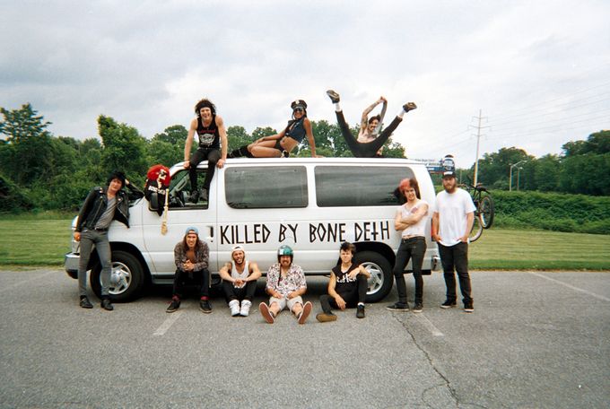
Once you’ve narrowed down your preferred spec, features and price range, you’ll almost certainly still face a handful of options from a range of different companies, so how do you decide? I think it’s safe to say you simply choose the company you like. It could be the one who sponsors your favourite rider, has the funniest adverts, the dopest stickers, or puts out the best web edits.

“Gimmicks are pointless and most riders see straight through them.”

In an industry where companies are by and large selling the same products, their branding (i.e. what you think of them) is extremely important and becomes their sole differentiator. How do companies go about deciding what image they want to promote and what elements influence this?


THE TEAM

Possibly the most important factor for a brand to consider, at the very least on par with the actual products themselves, the dudes who make up a team go a long way to representing the brand in the right (or wrong) way.

If you were tasked with hand-picking a dream team for your hypothetical BMX start-up and money was no object, how would you go about it? A who’s who of the best? That’s one way, but there are certainly a number of other factors to consider. Think about what image you are trying to convey and build a team that ties in with that as much as possible.

  • Are you a street, park or dirt brand? Diving further within this, do you want to represent tech, burly or stylish riding? Or big tricks?
  • What music do the riders like? After all, they’ll certainly want a say in what goes in their edits.
  • How do your riders dress? You may think this is beside the point and that the riding should do the talking, but ‘fashion’ can help determine who the brand appeals to. Take Bone Deth as one example: the punk/metal/horror style of their image is just as much a part of the company identity as the riding and, arguably, sells more than the products themselves.
  • Geographic location. Look at Animal, who have pretty much defined the image of the East Coast, backed up by the majority of riders they have on the team. OSS, revolving around LA – that’s where their team are, where their edits are filmed and the city’s image is very much at the forefront of the company. BSD, with Glasgow in the UK and Arizona in the US, the team’s physical locations have become a core part of the brand persona.

The Bone Deth team and their distinctive image. Photo Dean Dickinson / Defgrip

Of course, with all of these elements there is a balance. Yes, find your niche, but don’t go so far as to end up with a team of clones. Just like the wider business world, niche is important but operating in the relatively small market that BMX is, go too small and you’re only limiting yourself. However, go too broad and risk not really appealing to anyone.

“Yes, find your niche, but don’t go so far as to end up with a team of clones.”

GRAPHICS AND IMAGERY

In years gone by, graphics were very often an afterthought in the BMX world. Adverts were not much more than a riding photo and some product spec, packaging was typically plain cardboard and clothing was rarely more than a basic logo printed in the centre of a Fruit of the Loom T-shirt.

These days I’m glad to see more BMX companies developing this aspect of their brand more. Macneil were one of the first I remember doing it well, adding urban-art style graphics and typography to their printed ads and packaging. Nowadays, Shadow have promoted their signature coffin across advertising, packaging and events, along with a core focus on black as their primary colour. Subrosa have their dark, almost goth-like imagery with a simple black and white appeal to their photos, videos and soft goods. Another brand that I feel is really doing it well is Cult, using the ‘religious cult’ theme with vintage video and photos, tied together across all touch points: packaging, video, clothing, web, print, parts graphics and more.

Macneil going above and beyond the typical cardboard box packaging.

VIDEO AND MUSIC

The most widely used tool in most companies’ marketing arsenal – video – should (hopefully) tie in closely with the images and graphics used across all the other media channels.

Video branding includes a massive range of elements to consider – the equipment used (i.e. HD vs VX, drones, glide cams, etc), the filmer’s own techniques, their editing style, music genre – keep these consistent and your audience will learn to associate them with your company, so much so that if you add a new rider or change a logo, they’ll still know it’s you. However, chop and change filmers and equipment too often and you’ll never really establish a look that’s your own. Just read the list below.

These filmers, along with their styles of editing, equipment and tastes in music, almost feel as much a part of the brand as the products and riders themselves.

“Support the ones doing it right.”

Team, imagery and graphics are just a few of the more prominent elements that make up a BMX brand, and even with these I haven’t delved too deeply – after all this isn’t a business lecture! But in an effective brand, all these elements are interlinked and should run through everything they do. With that in mind I also have a couple of additional honourable mentions:

  • Cult and their URL – cultcrew.com as opposed to something more typical like cultbmx.com – helps further reiterate the close knit, family vibe they’re going for.
  • Subrosa and their Skeleton Crew. Going outside the normal naming convention of ‘Flow Team’ or ‘Am Squad’ and using a name that ties in far better with their overall image.


There you have it. When sitting down to write this I never intended it to be a ‘BMX Branding How To’, but more a rambling of my thoughts and observations along with a chance to highlight the brands that I feel are doing it well. And it’s no coincidence that many of the companies I have mentioned also happen to be some of the most popular in BMX right now.

Next time you’re looking for parts or watching the latest hot web video, have a think about what it is you like and don’t like about that company and why that might be, then support the ones doing it right.

Share

Newsletter Terms & Conditions

Please enter your email so we can keep you updated with news, features and the latest offers. If you are not interested you can unsubscribe at any time. We will never sell your data and you'll only get messages from us and our partners whose products and services we think you'll enjoy.

Read our full Privacy Policy as well as Terms & Conditions.

production